[is-mobile] [/is-mobile]
Handling Cross Browser Compatibility has always been an issue for web developers. In today’s world wide web it’s not uncommon for website visitors to be using many different browsers on many different types of devices. The options seems almost unlimited with Mozilla Firefox, Google Chrome, Opera, Safari, and of course “the beast” Internet Explorer. There are also many lesser known browsers and 3rd party software for Mac and Linux Operating Systems along with the numerous gaming devices capable of displaying web content. Not to mention the endless number of mobile devices
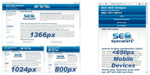
This presents a challenge for both business owners and website designers when trying to create a visually appealing website. So what is the best screen size and monitor resolution to build your website to fit? 800×600, 1024×768, 1366×768? The answer is there isn’t one! It is impossible to design a website to look the same in every browser, platform and screen resolution, it can’t be done. The modern approach to meeting this challenge is a responsive website design. A responsive website is a fluid page that adapts to any device, regardless of screen size or resolution settings.
With the introduction of CSS3 and a feature called media queries to detect the visitor’s screen size, cross browser/device compatibility became a whole lot easier. The only downside to using media queries is the lack of support in older versions of IE. As is the case with many CSS3 features, media queries aren’t supported in IE 8 and below. Let’s hope those IE dinosaurs die out soon!
A responsive web design will detect the width of the screen or window on loading and will then size and deliver content based on that width. This technique is fast becoming the preferred method for developing websites that are mobile friendly. However it is one of the most difficult in web development to implement, making it something that a number of us were eager to try. Several of us have built elastic websites for clients in the past, but none of us had never taken it to this level before. When we finally got the green light to build a responsive design for our company, we dove right in and this website is the end result.
Device Compatibility Using the Screen Size Approach
At the core of every responsive web design is a fluid and flexible layout that adapts itself to the screen size and features of the user’s browser. Since the pages of our new website needed to adjust to scale, we decided to keep the layout simple. As we coded the templates, we allowed elements to maintain their natural document flow wherever possible. The less complicated the code, the easier it is to scale things properly. To keep things truly responsive, we used percentages instead of pixels for widths, padding, and margins. We also used multiple column stacks as well as column stacks within column stacks. This makes the number of possible layouts for the same webpage countless!
Device Compatibility by Substitution or Omission
Device detection and accommodation is a departure from a true responsive approach to web development. But in balancing page optimization with mobile device requirements, we ended up with a hybrid approach for our website. A good example of device compatibility by substitution is the image at the top of this page. When this page is loaded on a mobile device a smaller version of the image is loaded without the zoom features. This eliminates the need to load the larger version of the image as well as the large JavaScript files that drive the zoom feature improving load time and reducing bandwidth usage. An example of device compatibly by omission is the slider on our homepage. The same information contained in the slider is also displayed in horizontal buttons on the desktop version of the homepage. The buttons stack up vertically and display nicely on all mobile devices making the slider unnecessary.
Social media like and share buttons are another good example of device compatibly by omission. They are everywhere you look on the internet. It’s easy to overlook the fact that including these social buttons on a web page means they will load several large JavaScript files. The fewer files that need to be loaded, the lower the bandwidth. This is crucial on mobile devices. Therefor the social share buttons are omitted when this website loads on a mobile device. We also chose to omit Facebook commenting on the blog post for mobile devices for the same reasons.
We made several other minor accommodations for mobile devices. When the website is loaded on a mobile device a ‘back to the top’ button is added to the bottom of each page. Also the main navigation menu is dropped down in a “button” style menu for easy click ability. Extra padding is added around links in content to make them more touch friendly. We also created smaller images and used server-side mobile detection to swap the image source from the full size version to save bandwidth and load time for our mobile visitors.
